Brand
Orby marks, colors, and press assets for articles, social posts, and partner pages. Use these guidelines when you mention Orby — not to imply sponsorship or endorsement by us.
Logo
The Orby logotype is the primary mark. Default to lime on Orby black; white on dark, or black on white or lime, work when you need a reversed treatment. See Allowed combinations for other approved pairings.

Do not edit, distort, or reconfigure the logo. Recolor only with approved palette pairings (see Allowed combinations). A full brand kit with SVG and PNG exports will be available here soon.
Symbol
The orb mark works when the full logotype is already visible nearby — app icons, favicons, and compact UI chrome. Same color rules as the logotype.

Colors
Orby Lime and Orby Black are the primary colors — lime for the logotype and primary actions, black for backgrounds and type on bright surfaces. Orby Purple, Orby Blue, Orby Pink, and Orby Surface muted are supporting colors: purple for UI and gradients, blue for inline links, pink for warnings and severity, surface muted for panels and chrome.
- Orby Lime #C4FF00
- Orby Purple #3B00FF
- Orby Blue #00C4FF
- Orby Pink #FF00C4
- Orby Black #080808
- Orby Surface muted #202020
Allowed combinations
Lime on black is the default — use it wherever you can. These are the approved solid pairings. Orby Lime and white logotypes also work on top of renders when you need a branded overlay. Do not invent new colors or add effects to the logo.

Usage
Do
- Use Orby marks to show you use Orby or link to the app.
- Keep logos and colors as provided — no gradients or effects on the mark itself.
- Use “Orby” as an adjective (“Orby viewer”, “built with Orby”).
- Link to orby.studio when directing people to the product.
Don’t
- Imply Orby sponsors, endorses, or employs you without permission.
- Put Orby marks in your product name, logo, domain, or social handle.
- Modify, rotate, outline, or combine the mark with other logos.
- Use Orby assets on merchandise without written approval.
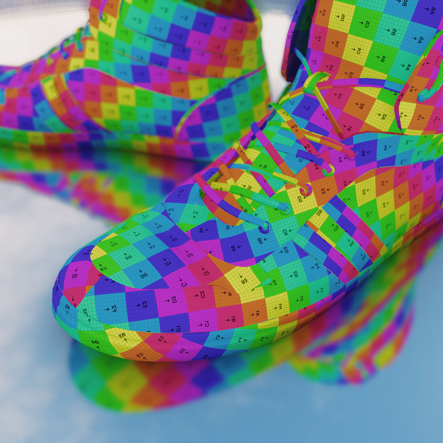
Press images
Screenshots and renders for articles and social posts. High-resolution downloads will be added to each card — for now, right-click to save preview images.
-
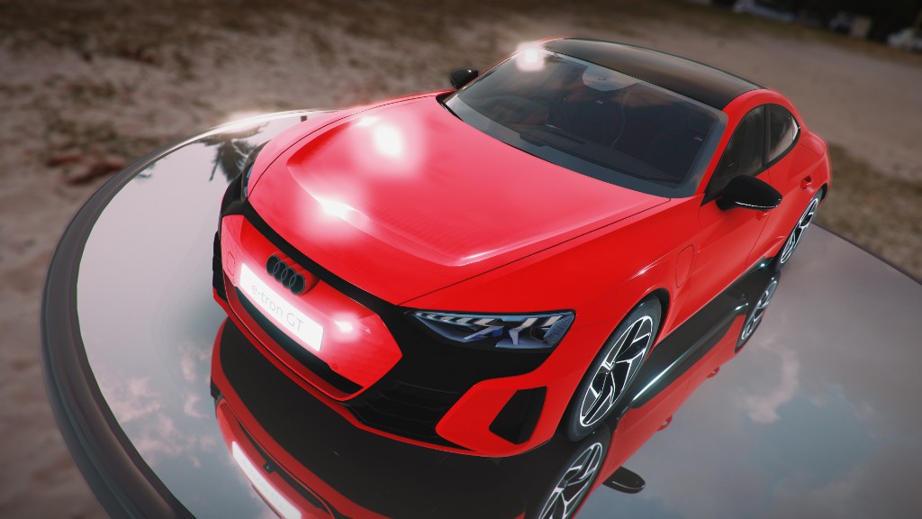
Showcase render
-
Logotype
-
App UI
Studio screenshot
-
Social
Social banner
Contact
Questions about brand use, press kits, or partnership assets: orby-admin@proton.me